Tag: Stats

  • Sample quotas all up in this place

    Sample quotas all up in this place

    Catching the Risk: The Maths Behind Sample Quotas in SEGs

    In occupational hygiene, we often talk about Similar Exposure Groups (SEGs) and the need to collect enough samples to be confident in our data. But how do we actually determine if our sample size is sufficient to capture those at the highest risk?

    Standard practice is to mornally just quote Technical Appendix A in NIOSH 173/77 and go from there – but this time, that just wasn’t going to be enough.

    During a recent mentoring session, we broke down the statistics of sampling quotas. Here is how the maths of permutations and combinations helps us ensure no worker is left behind.

    The Foundation: Factorials and Choices

    Before we can calculate the probability of a successful sampling campaign, we need to understand how many ways we can “choose” workers from a group.

    Factorials

    The factorial ($n!$) is the product of all positive integers less than or equal to $n$. This value represents the total number of ways you can uniquely arrange a set of items. For example, if you have 6 items and want to know every possible sequence they could be ordered in:

    $$6! = 6 \times 5 \times 4 \times 3 \times 2 \times 1 = \mathbf{720 \text{ ways to arrange 6 items}}$$

    Permutations vs. Combinations

    Understanding the difference between these two is critical for sampling.

    Permutations

    How many ways can I choose $r$ things from $n$ things where order is important? To use our example of 6 items, let’s say I want to select 2. I can do that by:

    $$6 \times 5 = 30$$

    To get that, using only factorials, we can use some numerator/denominator cancellation. It looks like this, noting how $4 \times 3 \times 2 \times 1$ appears in both the top and bottom and so cancel out:

    $$^nP_r = \frac{6!}{(6-2)!} = \frac{6!}{4!} = \frac{6 \times 5 \times 4 \times 3 \times 2 \times 1}{4 \times 3 \times 2 \times 1} = 6 \times 5 = 30$$

    MAGIC!

    The general formula is:

    $$^nP_r = \frac{n!}{(n-r)!}$$

    Combinations

    How many ways can I choose $r$ things from $n$ things where order is NOT important? In our example of 30 permutations of 2 items, we divide by the 2 ways those items can be arranged ($2 \times 1 = 2$). So let’s divide our permutation formula by the factorial of $r$:

    $$\frac{6!}{2! \times (6-2!)} = \frac{6 \times 5 \times 4 \times 3 \times 2 \times 1}{(2 \times 1)(4 \times 3 \times 2 \times 1)} = \frac{6 \times 5}{2} = 15$$

    $$^n\mathcal{C}_r = \frac{n!}{r! \times (n-r)!}$$

    Practical Example: Choosing 3 Workers from 10

    To see why this distinction matters, imagine you have a group of 10 workers ($n=10$) and you want to select 3 ($r=3$) for monitoring.

    The Permutation Approach (Order Matters)

    If we cared about the order (e.g., who gets the pump first, second, and third), the maths looks like this:

    $$^{10}P_3 = \frac{10!}{(10-3)!} = \frac{10!}{7!} = 10 \times 9 \times 8 = \mathbf{720 \text{ ways}}$$

    The Combination Approach (Order Does Not Matter)

    In a typical hygiene survey, we don’t care about the sequence—only the final set of people monitored. We divide the permutations by the ways those 3 people can be rearranged ($3!$):

    $$^{10}\mathcal{C}_3 = \frac{720}{3 \times 2 \times 1} = \frac{720}{6} = \mathbf{120 \text{ ways}}$$

    Why this matters: There are far fewer unique “groups” than “orders.” We use combinations because we are looking for the probability of a specific subset of the population being captured but what order we select them is not important.

    Defining the Sampling Problem

    When sampling a population ($N$), we are often looking for a specific “Target” group ($N_0$), such as a Highly Exposed Risk Group (e.g., the top 10% of exposed workers).

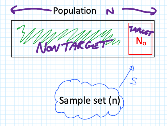
    The critical question is: What is the probability that I get ZERO samples from my high-risk group?

    To find this, we look at the three components of the probability calculation:

    Combinations of $n$ samples from the non-target group $(N – N_0)$.

    Combinations of 0 samples from the target group $(N_0)$.

    Total possible combinations of $n$ samples from the entire population ($N$).

    The maths behind this derivation follows a logical flow:

    $$P(r=0) = \frac{^{(N-N_0)}\mathcal{C}_n \times ^{N_0}\mathcal{C}_0}{^N\mathcal{C}_n}$$

    Since any combination of 0 items ($^{N_0}\mathcal{C}_0$) is equal to 1 (there is only 1 way to select nothing; it makes maths-sense, go with it), we expand the factorials as follows:

    $$P(r=0) = \frac{(N-N_0)!}{n!(N-N_0-n)!} \times \frac{N_0!}{0!(N_0-0)!} \times \left[ \frac{N!}{n!(N-n)!} \right]^{-1}$$

    By simplifying the expressions (flipping the $^N\mathcal{C}_n$ with a $-1$ power) and cancelling out terms (specifically $n!$), we arrive at the final simplified formula:

    $$P(r=0) = \frac{(N-N_0)!}{(N-N_0-n)!} \times \frac{(N-n)!}{N!}$$

    Case Study: Sampling a Population of 18

    Let’s apply this to a group of 18 workers ($N=18$). We want to ensure we haven’t missed the top 10% of exposed workers ($18 \times 0.1 = 1.8$, which we call 2 workers, so $N_0 = 2$).

    If we collect different sample sizes ($n$), how does your risk of “missing” ($r=0$) that high-risk group change?

    Scenario A: Collect 9 Samples ($n=9$)

    Using our formula $\frac{(N-N_0)!}{(N-N_0-n)!} \times \frac{(N-n)!}{N!}$:

    $$P(r=0) = \frac{(18-2)!}{(18-2-9)!} \times \frac{(18-9)!}{18!} = \frac{16!}{7!} \times \frac{9!}{18!} = \mathbf{0.235}$$

    With 9 samples, there is a 23.5% chance you will not capture a single person from that top 10% high-risk group.

    Scenario B: Collect 12 Samples ($n=12$)

    $$P(r=0) = \frac{(18-2)!}{(18-2-12)!} \times \frac{(18-12)!}{18!} = \frac{16!}{4!} \times \frac{6!}{18!} = \mathbf{0.098}$$

    By increasing to 12 samples, your risk of missing the high-risk group drops to roughly 9.8%.

    Scenario C: Collect 15 Samples ($n=15$)

    $$P(r=0) = \frac{(18-2)!}{(18-2-15)!} \times \frac{(18-15)!}{18!} = \frac{16!}{1!} \times \frac{3!}{18!} = \mathbf{0.0196}$$

    At 15 samples, the probability of missing the target group is less than 2%, providing a very high level of certainty.

    The “Flip It” Rule

    In hygiene, we usually want to know the confidence level—the probability of getting at least one sample from the target group ($r \ge 1$). To find this, simply “flip” the result:

    $$\text{Confidence} = 1 – P(r=0)$$

    With 12 samples, you have a 90.2% confidence level

    i.e. $(1-0.098) \times 100$.

    With 15 samples, you have a 98.04% confidence level 

    i.e. $(1-0.0196) \times 100$.

    By using these calculations, you can move away from “guessing” your sample quotas and start providing a statistical justification for your monitoring programs.

    BONUS: And I made a calculator for you!!

    Sample Quota calculator

  • Here comes the Beta distribution!!!

    Like flat-earthers, standard statistical models can sometimes be a little detached from reality. If you work in occupational hygiene, you’re likely intimately familiar with the Normal and Lognormal distributions. They are the bread and butter of our industry, but they have a specific quirk that drives me nuts: they allow for “infinite tails.”

    Mathematically, this means that standard models suggest there is always a tiny, non-zero probability that an exposure result will reach infinity. Obviously, that’s impossible. You can’t have a concentration of a chemical higher than pure vapour, and you can’t fit more dust into a room than the volume of the room itself. This is where the Beta Distribution steps in to save the day, and it’s why I’ve become such a vocal proponent of its use in our field (#AIOHStatsGang).

    The strength of the Beta distribution is that it has hard limits. It allows you to define a minimum and a maximum. By setting a ceiling—an upper bound—we stop the model from predicting unrealistically high results. We are effectively telling the math, “Look, physically, the exposure cannot go higher than X.” This seemingly small change completely removes those phantom probabilities of impossible exposure levels, giving us a statistical picture that actually obeys the laws of physics.

    In the chart above (generated using R-base), you can see that while both functions fit the data well, the Beta distribution respects a hard ceiling at 5, whereas the Lognormal tail simply drifts off into the impossible.

    But here’s the rub—switching to Beta isn’t for the faint of heart. The Lognormal distribution is easy; you can do it on a napkin with a $5 calculator. The Beta distribution is mathematically more complex and abstract. It’s harder to explain to a layman, and the formulas are heftier. But in my opinion, I’d rather struggle with the math for 10 minutes than present a risk assessment that implies a worker could be exposed to a billion ppm.

    This approach also forces us to be better specialists because it brings expert judgement back into the driver’s seat – or at least backseat driving. Because the model relies on fixed boundaries, you can’t just feed it data and walk away. You have to decide where to put those lower and upper bounds based on the specific environment. Today, there are PLENTY of AI tools to help you do this, even in Excel. It forces a deeper engagement with the process conditions rather than blind reliance on a pre-cooked spreadsheet (looking at you IHStat). It might be a headache to set up initially, but a model that respects physical reality is a model worth using.


    Further Reading

    For a deeper dive into the mathematics of the Beta distribution, check out:


    # This work is marked with CC0 1.0. 
    # To view a copy of this license, visit:
    # https://creativecommons.org/publicdomain/zero/1.0/
    
    # Author: Dean Crouch
    # Date: 27 January 2026
    
    # Load necessary libraries
    if (!require(MASS)) install.packages("MASS")
    if (!require(ggplot2)) install.packages("ggplot2")
    library(MASS)
    library(ggplot2)
    
    # ===========================================================================
    # Function: fit_beta_and_lognormal
    # (Fits both distributions and plots them with extended axes)
    # ===========================================================================
    fit_beta_and_lognormal <- function(data, min_val = 0, max_val = 5) {
      
      # --- 0. VALIDATION CHECK ---
      # Check if any data points fall outside the specified range
      if (any(data < min_val | data > max_val)) {
        message("Error: Data contains values outside the range [", min_val, ", ", max_val, "]. Update your assumed min & max. Exiting function.")
        message(list(data[data < min_val | data > max_val]))
        return(NULL) # Exits the function early
      }
      
      # --- 1. PREPARE DATA ---
      # Since we validated above, data_clean will be the same as data, 
      # but we'll keep the variable name for consistency with your original logic.
      data_clean <- data 
      epsilon <- 1e-6 # Nudge for boundaries
      
      # --- 2. FIT BETA (Red) ---
      # Normalize to [0, 1]
      data_norm <- (data_clean - min_val) / (max_val - min_val)
      data_norm[data_norm <= 0] <- epsilon
      data_norm[data_norm >= 1] <- 1 - epsilon
      
      fit_beta <- fitdistr(data_norm, "beta", start = list(shape1 = 1, shape2 = 1))
      alpha_est <- fit_beta$estimate["shape1"]
      beta_est <- fit_beta$estimate["shape2"]
      
      # --- 3. FIT LOG-NORMAL (Blue) ---
      data_lnorm <- data_clean
      data_lnorm[data_lnorm <= 0] <- epsilon 
      
      fit_lnorm <- fitdistr(data_lnorm, "lognormal")
      meanlog_est <- fit_lnorm$estimate["meanlog"]
      sdlog_est <- fit_lnorm$estimate["sdlog"]
      
      # --- 4. PLOTTING ---
      df <- data.frame(val = data_clean)
      
      p <- ggplot(df, aes(x = val)) +
        # Histogram
        geom_histogram(aes(y = after_stat(density)), bins = 40, fill = "lightgray", color = "white") +
        
        # Beta Curve (RED)
        stat_function(fun = function(x) {
          dbeta((x - min_val) / (max_val - min_val), alpha_est, beta_est) / (max_val - min_val)
        }, aes(colour = "Beta (Red)"), linewidth = 1.2) +
        
        # Log-Normal Curve (BLUE)
        stat_function(fun = function(x) {
          dlnorm(x, meanlog_est, sdlog_est)
        }, aes(colour = "Log-Normal (Blue)"), linewidth = 1.2) +
        
        # Styling
        scale_x_continuous(limits = c(min_val, max_val)) +
        scale_colour_manual(name = "Fitted Models", 
                            values = c("Beta (Red)" = "red", "Log-Normal (Blue)" = "blue")) +
        labs(title = paste("Fit Comparison [", min_val, "-", max_val, "]"),
             subtitle = "Red = Beta Fit | Blue = Log-Normal Fit",
             x = "Value", y = "Density") +
        theme_minimal() +
        theme(legend.position = "top")
      
      print(p)
    }
    
    # ===========================================================================
    # Usage Example with BETA Data
    # ===========================================================================
    set.seed(42)
    
    # 1. Define Range
    my_min <- 0
    my_max <- 5
    
    # 2. Generate Dummy Data using rbeta (The "True" Source)
    # We use shape1=2 and shape2=5, then scale it to 0-5
    observed_data <- (rbeta(n = 10, shape1=2, shape2=5) * (my_max - my_min)) + my_min
    
    # 3. Run the Fitting Function
    fit_beta_and_lognormal(observed_data, min_val = my_min, max_val = my_max)