Some while back I had a paper published int he Radiation Protection in Australia journal, the official journal of the Australasian Radiation Protection Society. It was a passion project as at the time no-one could tell me why the pass/fail values for the chi-squared test we did for alpha counting were what they were (ref DMP NORM-3.4).
So I deep dived it, wrote up the manuscript, got my wife to help and eventually proof read and BAM – we co-authored a paper together.
This was actually the first time I realised I could contribute back this way and started a landslide of presnetations, a whole website just so I can drop math-bombs (this website) and other ‘things’.
This dataset $[0.1, 0.2, 0.05]$ is the sample set used in Hewett, 2006 so we’re going to use it here too. It perfectly illustrates why the Upper Tolerance Limit (UTL) (the defensive choice for occupational hygiene), and the Upper Confidence Limit (UCL) (serves a different purpose than ‘most exposed worker in a group’) both fail when sample sizes are small.
To paraphrase multiple regulators I’ve spoken to:
“We are not as interested in the average exposure to a work group as the potentially highest exposure end of the workgroup exposure distribution”.
This is where the langauge gets loose and terms are used interchangably; specfically UCL and UTL.
The Core Difference
UCL (of the Mean): Estimates where the average exposure lies, or the limit below which you are confident it sit under.
UTL (95/95): Estimates the limit where the worst-case (95th percentile) of the worse-case of exposures of the population – not the sample set- lie with high confidence.
The $k$-factor for small datasets
The $k$-factor is a statistical multiplier used to calculate one-sided tolerance limits (like the 95/95 UTL) when the true population mean and standard deviation are unknown. Unlike a standard Z-score—which assumes you have perfect knowledge of the entire population—the $k$-factor explicitly accounts for the sampling error inherent in small datasets. It acts as a “safety margin” or uncertainty penalty: because we are estimating the distribution from only a few data points, $k$ must be significantly larger than a Z-score to ensure we maintain our desired confidence level (e.g., 95%) that a specific proportion of the population is actually covered.
As the sample size ($n$) increases and our estimate of the population becomes more reliable, the $k$-factor decreases, eventually converging toward the standard normal quantile ($1.645$ for the 95th percentile) as $n$ approaches infinity.
Comparison of $k$ vs. $z$ (95% Confidence / 95% Coverage)
Sample Size (n)
k-factor
Z-score (z0.95)
The “Uncertainty Penalty”
3
7.656
1.645
+365%
10
2.911
1.645
+77%
30
2.220
1.645
+35%
$\infty$
1.645
1.645
0%
The Worked Example
With only three data points, the uncertainty is massive. Even though your “best guess” (point estimate) for the 95th percentile is low, the statistical safety margin required for 95% confidence is huge.
Metric
Calculation Logic
Result
Context
Point Estimate (95th %ile)
$\exp^{(\bar{y} + 1.645 \cdot s_y)}$
0.31
“The most likely 95th percentile.”
UCL95 (of the Mean)
Land’s H-statistic calculation
~2.8
“We are 95% sure the average is below 2.8.”
UTL 95/95
$\exp^{(\bar{y} + 7.656 \cdot s_y)}$
20.2
“We are 95% sure 95% of shifts are below 20.2.”
How to Calculate It
The “jump” from 0.31 to 20.2 happens because of the $k$-factor, which penalizes the small sample size ($n=3$).
Log-Transform the data
$\ln(0.05) = -3.0$,
$\ln(0.1) = -2.3$,
$\ln(0.2) = -1.6$
Descriptive statistics
$\bar{y} = -2.3$, $GM = 1.0$
$s_y = 0.693$, $GSD = 2.00$
Select the K-Factor
Account for n=3. For a 95/95 limit with 3 samples, use $k = 7.656$. (For $n=20$, this would drop to ~2.4).
You can use this tool to see how increasing your sample size ($n$) collapses the massive gap between your point estimate (0.31) and your defensible 95/95 limit (20.2).
The 95/95 Tolerance Simulator
This tool demonstrates the difference between a Point Estimate (a best guess) and the 95/95 UTL (the defensible compliance limit). As sample size increases, the gap between these two numbers narrows.
Small sets carry a high “uncertainty penalty.”
Calculated Exposure Limits
Point Estimate (95th %ile)0.31
95/95 Upper Tolerance Limit20.2
The red bar shows the “Defensible Limit.”
UCL (Upper Confidence Limit): Used for long-term averages. For the set above, the UCL of the mean is ~2.8. It is lower than the UTL because it measures the group average, not individual extreme shifts.
UTL (Upper Tolerance Limit): This is the 95/95 limit. With only 3 samples, the UTL of 20.2 is roughly 65 times higher than the point estimate. By increasing your sample size to 20, you’ll see the UTL “penalty” drop dramatically.
Catching the Risk: The Maths Behind Sample Quotas in SEGs
In occupational hygiene, we often talk about Similar Exposure Groups (SEGs) and the need to collect enough samples to be confident in our data. But how do we actually determine if our sample size is sufficient to capture those at the highest risk?
Standard practice is to mornally just quote Technical Appendix A in NIOSH 173/77 and go from there – but this time, that just wasn’t going to be enough.
During a recent mentoring session, we broke down the statistics of sampling quotas. Here is how the maths of permutations and combinations helps us ensure no worker is left behind.
The Foundation: Factorials and Choices
Before we can calculate the probability of a successful sampling campaign, we need to understand how many ways we can “choose” workers from a group.
Factorials
The factorial ($n!$) is the product of all positive integers less than or equal to $n$. This value represents the total number of ways you can uniquely arrange a set of items. For example, if you have 6 items and want to know every possible sequence they could be ordered in:
Understanding the difference between these two is critical for sampling.
Permutations
How many ways can I choose $r$ things from $n$ things where order is important? To use our example of 6 items, let’s say I want to select 2. I can do that by:
$$6 \times 5 = 30$$
To get that, using only factorials, we can use some numerator/denominator cancellation. It looks like this, noting how $4 \times 3 \times 2 \times 1$ appears in both the top and bottom and so cancel out:
How many ways can I choose $r$ things from $n$ things where order is NOT important? In our example of 30 permutations of 2 items, we divide by the 2 ways those items can be arranged ($2 \times 1 = 2$). So let’s divide our permutation formula by the factorial of $r$:
In a typical hygiene survey, we don’t care about the sequence—only the final set of people monitored. We divide the permutations by the ways those 3 people can be rearranged ($3!$):
Why this matters: There are far fewer unique “groups” than “orders.” We use combinations because we are looking for the probability of a specific subset of the population being captured but what order we select them is not important.
Defining the Sampling Problem
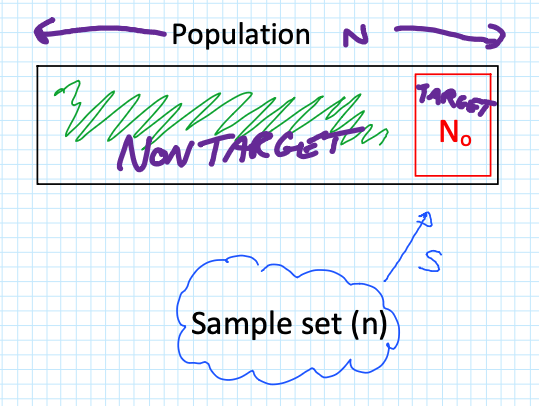
When sampling a population ($N$), we are often looking for a specific “Target” group ($N_0$), such as a Highly Exposed Risk Group (e.g., the top 10% of exposed workers).
The critical question is: What is the probability that I get ZERO samples from my high-risk group?
To find this, we look at the three components of the probability calculation:
Combinations of $n$ samples from the non-target group $(N – N_0)$.
Combinations of 0 samples from the target group $(N_0)$.
Total possible combinations of $n$ samples from the entire population ($N$).
The maths behind this derivation follows a logical flow:
Since any combination of 0 items ($^{N_0}\mathcal{C}_0$) is equal to 1 (there is only 1 way to select nothing; it makes maths-sense, go with it), we expand the factorials as follows:
By simplifying the expressions (flipping the $^N\mathcal{C}_n$ with a $-1$ power) and cancelling out terms (specifically $n!$), we arrive at the final simplified formula:
Let’s apply this to a group of 18 workers ($N=18$). We want to ensure we haven’t missed the top 10% of exposed workers ($18 \times 0.1 = 1.8$, which we call 2 workers, so $N_0 = 2$).
If we collect different sample sizes ($n$), how does your risk of “missing” ($r=0$) that high-risk group change?
Scenario A: Collect 9 Samples ($n=9$)
Using our formula $\frac{(N-N_0)!}{(N-N_0-n)!} \times \frac{(N-n)!}{N!}$:
At 15 samples, the probability of missing the target group is less than 2%, providing a very high level of certainty.
The “Flip It” Rule
In hygiene, we usually want to know the confidence level—the probability of getting at least one sample from the target group ($r \ge 1$). To find this, simply “flip” the result:
$$\text{Confidence} = 1 – P(r=0)$$
With 12 samples, you have a 90.2% confidence level
i.e. $(1-0.098) \times 100$.
With 15 samples, you have a 98.04% confidence level
i.e. $(1-0.0196) \times 100$.
By using these calculations, you can move away from “guessing” your sample quotas and start providing a statistical justification for your monitoring programs.
A very good explanation why I chose to start a personal professional website, and create content here, instead of handing my ideas over to the social media platforms.
And yes, I had to learn a LOT to get this up and running and it was very satisfying.
“Contaminated” isn’t a binary state. It’s the start of a conversation, not the end of one.
In the world of radiation protection, there is a common reflex to treat “contamination” as a hard “No” for the release of items or materials. If it’s contaminated, it stays in the controlled zone. Simple, right?
Actually, no. You’re making the solution harder by making the problem easier.
The term “contamination” describes the presence of radioactive substances. It does not automatically define the risk, nor does it dictate a permanent restriction from the public domain. When we look at primary sources like IAEA-TECDOC-855, the logic is clear: we manage risk, not just atoms.
The IAEA framework for unconditional clearance is built on the principle of “triviality”—specifically, ensuring that the individual dose to a member of the public remains below ~10 µSv/year.
To achieve this, the IAEA doesn’t just guess; they categorise radionuclides across five orders of magnitude based on their hazard profile:
High Hazard (0.3 Bq/g): For nuclides like Co-60, Ra-226, and Pu-239, the clearance levels are appropriately conservative.
Moderate Hazard (30 Bq/g): Common isotopes like C-14 or P-32 have thresholds 100x higher than alpha emitters.
Low Hazard (3,000 Bq/g): For H-3 (Tritium) or Ni-63, the “trivial” threshold is ten thousand times higher than for Plutonium.
Key takeaways for RSOs and regulators:
Nuclide-Specific Nuance: Finding “contamination” on a Surface Contaminated Object (SCO) is just the trigger. The identity of the isotope changes the “acceptable” level by a factor of 10,000.
The Sum of Ratios: For mixtures, we don’t just look at the highest peak. We apply the rigorous formula to ensure the total impact remains trivial.
Surface vs. Bulk: In the absence of specific surface guidance, the TECDOC suggests that these same numerical values (Bq/g) can often be applied as surface contamination limits (Bq/cm2) for unconditional release.
We need to move past the “zero-tolerance” myth and lean back into the science of clearance. The definition of contamination identifies the presence; the science of clearance determines the future.
Let’s stop asking “Is it contaminated?” and start asking “What is the actual risk, and how do we optimise the outcome?”
References
IAEA (1996). Clearance levels for radionuclides in solid materials: Application of exemption principles. Interim report for comment. IAEA-TECDOC-855. Vienna.
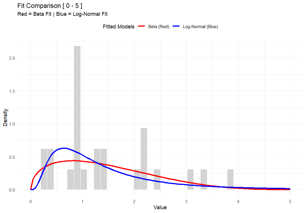
Like flat-earthers, standard statistical models can sometimes be a little detached from reality. If you work in occupational hygiene, you’re likely intimately familiar with the Normaland Lognormaldistributions. They are the bread and butter of our industry, but they have a specific quirk that drives me nuts: they allow for “infinite tails.”
Mathematically, this means that standard models suggest there is always a tiny, non-zero probability that an exposure result will reach infinity. Obviously, that’s impossible. You can’t have a concentration of a chemical higher than pure vapour, and you can’t fit more dust into a room than the volume of the room itself. This is where the Beta Distribution steps in to save the day, and it’s why I’ve become such a vocal proponent of its use in our field (#AIOHStatsGang).
The strength of the Beta distribution is that it has hard limits. It allows you to define a minimum and a maximum. By setting a ceiling—an upper bound—we stop the model from predicting unrealistically high results. We are effectively telling the math, “Look, physically, the exposure cannot go higher than X.” This seemingly small change completely removes those phantom probabilities of impossible exposure levels, giving us a statistical picture that actually obeys the laws of physics.
In the chart above (generated using R-base), you can see that while both functions fit the data well, the Beta distribution respects a hard ceiling at 5, whereas the Lognormal tail simply drifts off into the impossible.
But here’s the rub—switching to Beta isn’t for the faint of heart. The Lognormal distribution is easy; you can do it on a napkin with a $5 calculator. The Beta distribution is mathematically more complex and abstract. It’s harder to explain to a layman, and the formulas are heftier. But in my opinion, I’d rather struggle with the math for 10 minutes than present a risk assessment that implies a worker could be exposed to a billion ppm.
This approach also forces us to be better specialists because it brings expert judgement back into the driver’s seat – or at least backseat driving. Because the model relies on fixed boundaries, you can’t just feed it data and walk away. You have to decide where to put those lower and upper bounds based on the specific environment. Today, there are PLENTY of AI tools to help you do this, even in Excel. It forces a deeper engagement with the process conditions rather than blind reliance on a pre-cooked spreadsheet (looking at you IHStat). It might be a headache to set up initially, but a model that respects physical reality is a model worth using.
Further Reading
For a deeper dive into the mathematics of the Beta distribution, check out:
As real-time air monitoring technology advances—offering continuous readouts, data logging, and automated alarms—it’s easy to think that traditional filter-based sampling has had its day. After all, who wouldn’t prefer instant feedback over waiting days for lab results? The efficiency, precision, and cost-effectiveness of modern sensors have truly revolutionized how we track airborne particulates and radiation levels.
But as impressive as these systems are, they cannot do everything. In our rush toward automation and real-time analytics, we risk losing something fundamental: the ability to collect, measure, and verify what’s physically in the air.
The Irreplaceable Value of Physical Samples
A real-time dust monitor can tell you how much particulate matter is present and even differentiate by size fraction or inferred composition. What it cannot do is tell you the radiological character of those particles—especially when it comes to long-lived alpha-emitting radionuclides.
Only a physical filter sample can be analysed through alpha spectrometry or alpha counting. This step is essential for identifying isotopes such as uranium and thorium, and their decay products, which contribute disproportionately to dose despite their low concentrations. Without collecting filters, you lose the capacity to confirm and quantify these materials—and with it, the ability to fully assess worker or environmental exposure.
The Risk of Forgetting
As new technologies streamline monitoring programs, there’s a growing generation of occupational hygienists who may find themselves performing radiation protection who may never have handled a filter cassette or managed a sampling train. If physical sampling becomes a lost art, so too does our ability to detect and interpret the presence of long-lived alpha activity—a cornerstone of radiological protection.
A Call to Keep the Skill Alive
So, let’s keep teaching it. Let’s keep sampling. Even in an era of smart sensors and predictive analytics, the humble filter remains indispensable.
It’s not nostalgia; it’s about maintaining a complete toolkit. In radiation protection, that toolkit still matters.
I was ‘robustly corrected’ this week when I referred to them as ARPANSA Codes of Practice and then again later as National Codes of Practice. The correction was that they are Australian Codes of Practice, published by ARPANSA.
While ARPANSA does a lot of work to get them to users, they are, in fact, drafted by the Radiation Health Committee (RHC), state and territory regulators, approved by the Radiation Health and Safety Advisory Council and THEN published by ARPANSA. ARPANSA is not a National regulator, even though they do support them under the Australian Radiation Protection and Nuclear Safety Act (link).
The comparison I was given was “It isn’t referred to as Penguin Books Pride and Prejudice” just because they were the publisher. Fair point.
The following is from the introduction of the Code for the Safe Transport of Radioactive Material, RPSC-2, and is present in most other ARPANSA published documents that fit the purpose of a fundamental, code or guide.
“The Australian Radiation Protection and Nuclear Safety Agency (ARPANSA) publishes Fundamentals, Codes and Guides in the Radiation Protection Series (RPS), which promote national policies and practices that protect human health and the environment from harmful effects of radiation. ARPANSA develops these publications jointly with state and territory regulators through the Radiation Health Committee (RHC), which oversees the preparation of draft policies and standards with the view of their uniform implementation in all Australian jurisdictions. Following agreement, the CEO of ARPANSA will seek the endorsement of the Radiation Health and Safety Advisory Council, and publish the document.”
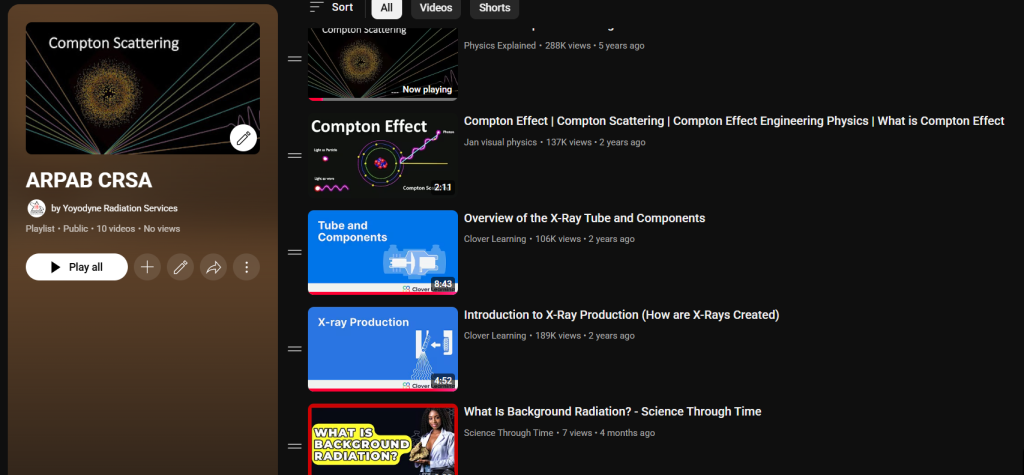
I’ve always struggled to come up with an appropriate reading list for the CRSA exam. It’s either a fistful of textbooks which go into excruciating detail on how x-ray tubes work, or it’s a two paragraph explanation that isn’t helpful.
To address this, I’ve put together a YouTube playlist which I hope will be helpful. This playlist is by no means complete, and I may add to it over time as the question bank evolves but for those who have experience in only one or two specific areas of radiation protection, this is intended to be a primer into the other areas. For instance, medical physicists who need to know about radiation in mining, or radiologists who need to know about transport.
If there are any other videos you think should be added, please leave a comment below.